#rebrand
#logodesign
#packaging
#illustration
Giving Skin Care a New Look
Giving Skin Care a New Look
Giving Skin Care a New Look
Giving Skin Care a New Look
Giving Skin Care a New Look
Giving Skin Care a New Look
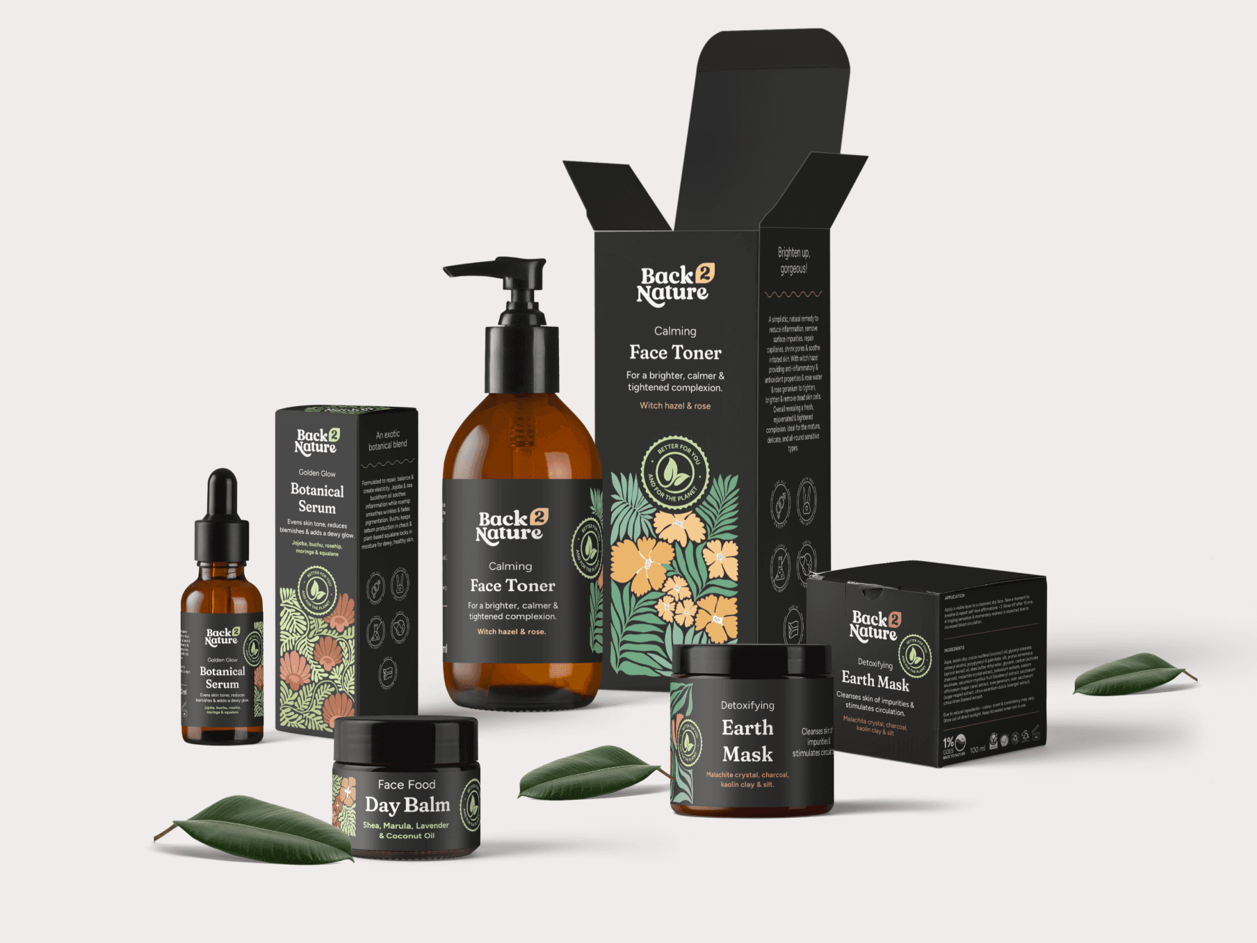
Back 2 Nature approached us with the challenge of bringing a new fresh look to the brand. The project included a new visual identity and packaging design that would help the brand align to their target market.
Back 2 Nature approached us with the challenge of bringing a new fresh look to the brand. The project included a new visual identity and packaging design that would help the brand align to their target market.
Back 2 Nature approached us with the challenge of bringing a new fresh look to the brand. The project included a new visual identity and packaging design that would help the brand align to their target market.
Back 2 Nature approached us with the challenge of bringing a new fresh look to the brand. The project included a new visual identity and packaging design that would help the brand align to their target market.
Back 2 Nature approached us with the challenge of bringing a new fresh look to the brand. The project included a new visual identity and packaging design that would help the brand align to their target market.
Back 2 Nature approached us with the challenge of bringing a new fresh look to the brand. The project included a new visual identity and packaging design that would help the brand align to their target market.
Timeline
2023-2024
Role
Lead Designer
Timeline
2023-2024
Role
Lead Designer
Timeline
2023-2024
Role
Lead Designer
Timeline
2023-2024
Role
Lead Designer
Timeline
2023-2024
Role
Lead Designer
Background
Background
Back 2 Nature is driven by a profound mission to inspire people to reconnect with nature. Nature offers a wealth of beautiful, raw, healing, and authentic qualities that not only enhance our overall health but also draw us closer to our purpose and interconnectedness within the natural world.
Back 2 Nature is driven by a profound mission to inspire people to reconnect with nature. Nature offers a wealth of beautiful, raw, healing, and authentic qualities that not only enhance our overall health but also draw us closer to our purpose and interconnectedness within the natural world.
Problems
Problems
While Back 2 Nature had been performing well with sales to an older generation, aged between 30 and 50 years, the brand faced a challenge. The existing branding and packaging design did not resonate with the aesthetic preferences and expectations of this mature audience.
While Back 2 Nature had been performing well with sales to an older generation, aged between 30 and 50 years, the brand faced a challenge. The existing branding and packaging design did not resonate with the aesthetic preferences and expectations of this mature audience.
1
Maturing the Brand
Our objective was to refine the logo, lending it a more mature appearance while preserving the playful essence that defines Back 2 Nature.
1
Maturing the Brand
Our objective was to refine the logo, lending it a more mature appearance while preserving the playful essence that defines Back 2 Nature.
1
Maturing the Brand
Our objective was to refine the logo, lending it a more mature appearance while preserving the playful essence that defines Back 2 Nature.
1
Maturing the Brand
Our objective was to refine the logo, lending it a more mature appearance while preserving the playful essence that defines Back 2 Nature.
1
Maturing the Brand
Our objective was to refine the logo, lending it a more mature appearance while preserving the playful essence that defines Back 2 Nature.
2
Gender Neutrality
Recognizing the brand's growing appeal among male consumers, we aimed to infuse a sense of masculinity into the brand's identity.
2
Gender Neutrality
Recognizing the brand's growing appeal among male consumers, we aimed to infuse a sense of masculinity into the brand's identity.
2
Gender Neutrality
Recognizing the brand's growing appeal among male consumers, we aimed to infuse a sense of masculinity into the brand's identity.
2
Gender Neutrality
Recognizing the brand's growing appeal among male consumers, we aimed to infuse a sense of masculinity into the brand's identity.
2
Gender Neutrality
Recognizing the brand's growing appeal among male consumers, we aimed to infuse a sense of masculinity into the brand's identity.


Solutions
Solutions
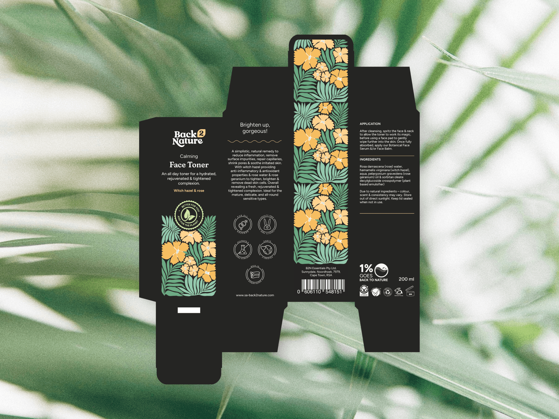
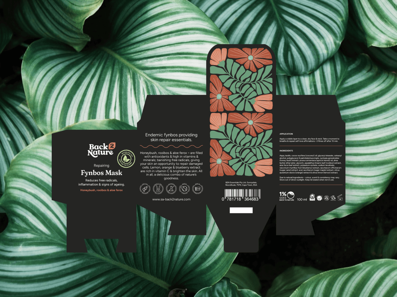
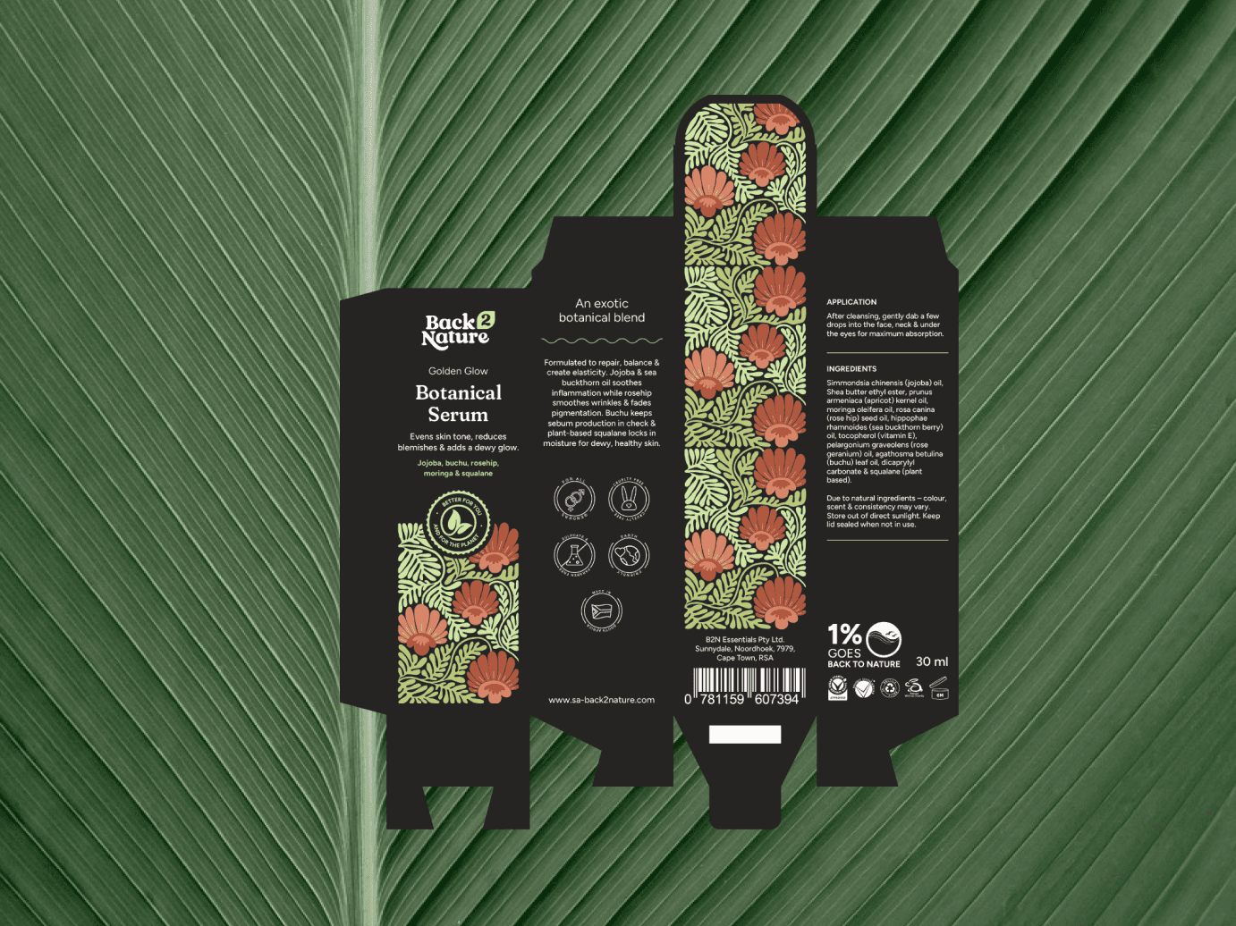
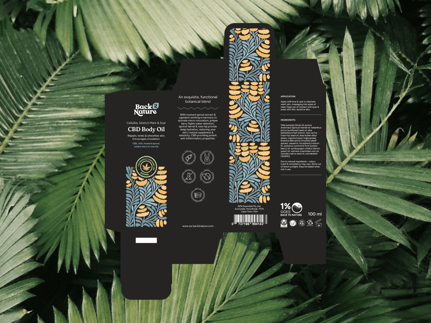
We revitalized Back 2 Nature with a sleek, dark background and pastel colors to make each product stand out. Our simple, modern illustrations highlight the natural ingredients, making the brand more inviting to a broader audience and imparting a luxurious feel.
We revitalized Back 2 Nature with a sleek, dark background and pastel colors to make each product stand out. Our simple, modern illustrations highlight the natural ingredients, making the brand more inviting to a broader audience and imparting a luxurious feel.
1
Branding & Logo
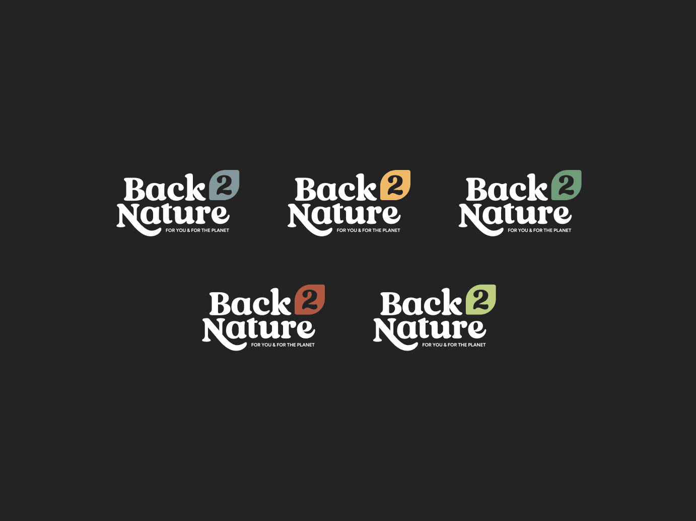
The logo features a playful organic typeface, with nature-inspired letterforms and a leaf element for clear legibility. We developed a color system with two core colors and tints to ensure consistency across the product range. A dominant color rule maintains a cohesive brand identity.
2
Packaging
The brand needed a new look that could compete on the shelves alongside 'luxury' competitors. Although Back 2 Nature did not want to be perceived as exclusively luxurious, they still aimed to be categorized alongside higher-priced products.
2
Packaging
The brand needed a new look that could compete on the shelves alongside 'luxury' competitors. Although Back 2 Nature did not want to be perceived as exclusively luxurious, they still aimed to be categorized alongside higher-priced products.
2
Packaging
The brand needed a new look that could compete on the shelves alongside 'luxury' competitors. Although Back 2 Nature did not want to be perceived as exclusively luxurious, they still aimed to be categorized alongside higher-priced products.
2
Packaging
The brand needed a new look that could compete on the shelves alongside 'luxury' competitors. Although Back 2 Nature did not want to be perceived as exclusively luxurious, they still aimed to be categorized alongside higher-priced products.
2
Packaging
The brand needed a new look that could compete on the shelves alongside 'luxury' competitors. Although Back 2 Nature did not want to be perceived as exclusively luxurious, they still aimed to be categorized alongside higher-priced products.










Tools
Tools
Figma
Adobe
Figma
Adobe
Figma
Adobe
Figma
Adobe
Figma
Adobe
